Tableau or Bust: Evaluating Proprietary and OS Data Visualization Tools for Social Sector Needs

Benjamin Kinsella
General Manager, Tribe AIAbstract: The quality of proprietary business intelligence (BI) software like Tableau and PowerBI seems to far outweigh available open source (OS) BI tools, which often push clients to use Tableau or PowerBI. Is it really Tableau or Bust? Are there no comparable OS tools? Or is there scope for OS tools to provide a level of quality that is effective for use in the MERL tech space? This article examines the gap to provide insight into how existing OS BI tools may be used, in which use cases, and outlines the development needed to reach the level of quality of proprietary tools.
*With contributions from Mala Kumar, Stephanie Coker, Luigi Nuñez, Melissa Edmiston, and Riya Singh*
Introduction
Effective data visualizations are crucial assets to any organization or mission. Visual analytics provide more than just a synthesis of data. They also serve as indispensable tools that allow teams to make programmatic and organization-level data-driven decisions, including reporting and organizational activities, monitoring and evaluation (M&E) metrics, and more. Having available software that allows teams to understand their data and activities through data visualizations is a critical component of any data mature organization.
In the current software landscape, which offers a myriad of visualization tools, teams and organizations struggle selecting new technologies that fit their needs and equally importantly, their budget. Ubiquitous tools like Tableau, PowerBI, or even Microsoft Excel prevail across many organizations, supporting nonprofits to transform their data into visual graphics. However, these proprietary solutions - that is, copyrighted software that limits against use, distribution, and/or modification - may include expensive licenses that fall outside an organization’s budget or needs.
On the other hand, Open Source Software (OS) may provide alternatives to costly proprietary tools. Whether one builds a solution from scratch or uses one of the many OS packages like R’s ggplot2, these software solutions are “free”. However, they come with many issues like privacy, interoperability, team upskilling, and other operational or labor costs.
In this guide, we focus our efforts on uncovering the nuances of selecting impactful visualization tools within the context of social impact organizations, as well as providing several micro case studies to bring those decisions to life. This guide does not exhaustively provide a list of OS alternatives. Rather, the focus is to provide the reader with an introduction to data visualization and tooling within the context of the social sector.
To begin, we’ll review several recent case studies that surface specific applications and even the tradeoffs encountered when working with one software over another. After, we’ll introduce a framework that solidifies the proprietary and OS divide and how software decisions are unique to the social sector.
How Might This Look in Practice? Sample MERL Case Studies Leveraging Data Visualization
Case Study #1: Analyzing Public Health Data in Tableau for the USAID Accelerate Project
In 2016 and 2017, the USAID ACCELERATE Project engaged a MERL consultant in order to help the program implementers leverage their program data and design behavior change programs in public health. The team created maps of program countries disaggregated at the sub-national level - mostly states and provinces - that were color coded by key adoption metrics, such as the percentage of pregnant women who had at least five prenatal visits in each province of Kenya. The team chose the public version of Tableau, principally because it was free and supported the geospatial data and sub-national boundary vector maps. However, the free version of Tableau did present several disadvantages. Tableau Public would only allow a user to create maps that would be displayed in their online visualization portfolio - rather than save directly to their desktop. While the dashboard would be published online, the project data was publicly available in a structured format, so there were no immediate privacy concerns. However, it was difficult to manage the maps in low-bandwidth areas.
Case Study #2: Visualizing Health Trends in Africa and Latin America Using DHIS2
An M&E team was tasked with tracking key health indicators in a number of Africa and Latin American countries, with a particular focus on malaria, HIV, TB, sexual and reproductive health, non-communicable diseases, and WASH. The team leveraged DHIS2, one the world’s largest OS health information management systems to build and share their analyses and data visualizations. In addition to ensuring standardized data, the interface allows for easy filtering, drag-and-drop, and indicator selection of visualizations. Some of these visualizations included a dashboard that presented temporal and geospatial trends, leveraging effective graphics (e.g., bar charts, line graphs, maps, etc.) as needed. The dashboard was able to be published online and shared through a URL.
Case Study #3: Leveraging Python’s Matplotlib to Analyze and Report Findings from data.org’s Inclusive Growth and Recovery Challenge
In 2021, data.org, with support from The Rockefeller Foundation and Mastercard Center for Inclusive Growth, issued a $10 million Challenge that sought proposals for scalable and sustainable data science solutions within the inclusive growth fields. With over 1,200 applications, the challenge yielded incredible insights into the ways data science and AI were being leveraged in the social sector. The funders shared these learnings in a report, which included a rigorous analysis of the submitted applications, the winners, and broader learnings for practitioners in the social impact space. The research team leveraged a cohort of Python packages (e.g., pandas, NLTK, etc.) to analyze the applications (i.e., textual) data and visualize the results using matplotlib. Conducting these analyses required the knowledge of programming, Natural Language Processing applications, and the ability to customize color palettes to match the report’s theme. As opposed to Tableau, using Python allowed the team to easily create the analysis in a reproducible form and transform the results into visualizations.
Case Study #4: Visualizing US Housing Data with QGIS to Combat Foreclosures
The housing nonprofit, New America, partnered with DataKind, a data science nonprofit, to predict and prevent housing loss that occurred as a result of the COVID-19 pandemic. Authoring a report for policy makers, the research team created a data pipeline using Python and SQL as the two principle OS tools in order to consolidate swaths of disparate open data sources into one single database. Having the data in a central location, the team then leveraged QGIS - the OS geospatial tool - to build powerful maps that effectively visualized housing loss. While the analytical tools chosen for this project were OS and required domain and programming knowledge, it was important that the analysis and data were reproducible and accessible to broader audiences, including policy makers, other housing nonprofits, and the general public.
The Proprietary and OS Tradeoff within the MERL Context
The above examples briefly capture the scope and use case of using common data visualization tools, surfacing some of the challenges and tradeoffs encountered in the MERL context. Before shifting the reader’s focus to specific software, it is important to briefly review what differentiates software decisions within the MERL context - as opposed to other industries.
How Different Can The Social Sector Be?
There’s a multitude of factors that differentiate the social sector and other sectors. One major concern is the organization’s budget and time resources to purchase licenses or train staff. For example, a practitioner may ask:
- Can I afford to purchase enough proprietary software licenses for my team?
- Can I afford the training required for this software?
- My team has the knowledge to build a customized OS solution. However, will the end user of my dashboard be able to run the script and interpret the results?
- Will my OS visualization be accessible on mobile phones?
- How can I ensure my visualization tool offers the most up-to-date security measures with two-factor authentication?
Other concerns may include the tool’s ability to handle different and complex data types, reproducibility, or even how often the tool is updated. For example:
- If I choose the free and “public” version of Tableau, it will be displayed online in a public folder. Will I run into any privacy issues when building a dashboard or must I purchase a license to make my visualizations private?
- Can I share my code, data, and analysis with stakeholders?
- My dashboard connects to dozens of APIs to acquire open data from different sources. What tool best serves that purpose without slowing the dashboard down?
A Software Decision-Making Framework
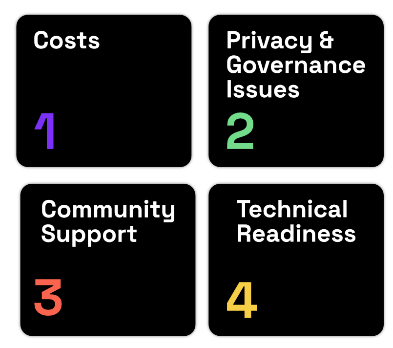
These most common software trade offs have been distilled into four key themes (1) software costs; (2) privacy and governance issues that are specific to the context and field; (3) the existing support and software community, albeit OS or proprietary; and similarly (4) the organization’s technical readiness that can support long-term maintenance. (See here for a more exhaustive overview).
More specifically:
Costs
As the most commonly recognized driver of decisions, a proprietary tool tends to have the following costs associated with its use: licenses or subscriptions, tech support, and more. However, the notion of “free” OS visualization tools includes many hidden costs, such as internal training and development and maintenance fees with external vendors. Moreover, there are often opportunity costs as a result of choosing one software alternative over another, for instance spending the time and resources to build a tool, when a proprietary alternative could be purchased for less.
Privacy and Governance Issues
Data is often highly sensitive. As a result, OS and proprietary visualization software must be evaluated against the myriad privacy and governance-related concerns to ensure adherence to ethical, privacy, security, legal and regulatory policies.
Community Support
While proprietary software is copyrighted and generally limits modification and distribution, OS is freely accessible and often supported by a community of developers. There are countless OS tools, some which have millions of users, like R and Python packages. Others are industry or domain-specific, like DHIS2, a global public health tool, or QGIS, for geospatial analysis. Whether the tool It is the case that many proprietary companies maintain OSS tools. Whatever the tool, every software has limits on how much it is updated and how many new features are rolled out, so it is important to be mindful of your needs and
Interoperability
Interoperability of the data visualization tool is a major requirement that can enable the growth and maintenance of any software solution. Broadly, interoperability refers to the ability for software and its interfaces to “understand” each other, including, for example, the use of common data formats, the exchange of information, as well as crOS-domain involvement with multiple stakeholders. One of the reasons R and Rstudio is so widely used is its price (i.e., free) and interoperability, particularly in its ability to bring in structured and unstructured data from a range of sources (e.g., Excel, CSV, the cloud, web, etc.).
Technical Readiness
While social sector organizations seek cost-effective outcomes that meet the requirements within their respective fields, a software solution can only go as far as the team and their technical readiness. Building a data mature ecosystem requires a confluence of factors, including but not limited to the organization’s data quality, skills, culture, application, leadership, and many other growth areas. So it is important that the practitioner select a data visualization tool that aligns with their organization and its level of technical readiness. Do the primary stakeholders understand - or need knowledge of - how to run and make changes to a Python or R script? Will you need to create a personalized training program for your staff? Or could you use Tableau’s many training programs? Data Maturity comes in all shapes and sizes, thus choosing a data visualization tool requires a delicate tradeoff between any proprietary and OS solution.
 Key themes of common software trade offs
Getting started with data visualization tools
Now equipped with a deeper understanding of software and data visualization use cases within the MERL context, one may ask: What does the landscape of visualization tools look like? And which ones are most commonly used?
In brief, there are a prolific number of data visualization tools to choose from. And each day, new tools, use cases, and their communities keep growing! The purpose of this section is not to exhaustively list all available visualization tools. Rather, we provide a brief list of the most common tools, a brief description, and relevant resources to get started.
Table 1: Common Data Visualization Software
| Data Visualization Software | Description | License |
|---|---|---|
| Tableau | One of the most popular visualization software, Tableau is the go-to tool for many organizations. While it is proprietary software with somewhat costly licenses, there is a free and public version, as well as heavy nonprofit discounts provided by the Tableau Foundation. | Proprietary |
| Microsoft PowerBI | Microsoft Power BI is a business intelligence (BI) platform that enables users to collaborate with data, mostly known for its privacy and security functionalities. The tool tends to be more operational and best suited for organizations that use Microsoft products. There is a public version, albeit offering limited features. | Proprietary |
| Looker Google Cloud | Google Cloud’s Looker is another BI tool that allows users to see data, known for its plugin marketplace. The tool offers a directory of different types of visualizations, as well as pre-made graphics that are plug and play. | Proprietary |
| Google Data Studio | Google Data Studio is an online tool for converting data into customizable informative reports and dashboards. Like Tableau or Power BI, Data Studio allows an organization to easily connect to a database using PostgreSQL integrations like sequin.io. This platform is free and is an excellent tool for visualizing internal data. | Proprietary |
| Sisense | Sisense is a business intelligence software that allows users to access and analyze big data, much like Tableau or Power BI. However, Sisense is greatly differentiated in offering a more granular control over data, giving administrators greater flexibility to assign roles and permissions to users. This is a great tool when Data Governance is a salient factor in the organization. | Proprietary |
| Zoho | Zoho is an incredibly high-touch and usable platform that allows users to import data from a variety of data sources and manipulate it using their drag-and-drop interface. Using these tools, users can create and collaborate on insightful reports and dashboards, as well as decide what others may see and do with them. Sharing reports is also easy. Users can publish reports and dashboards via email or embed them on websites. There is also a free, limited version. | Proprietary |
| R’s ggplot2 | Part of the tidyverse, ggplot2 is the go-to data visualization package for the statistical programming language R. ggplot2 is incredibly powerful and contains the commands to create highly complex visualizations from a data frame. It’s easy to get any visualization off the ground - though can become quite advanced. However, the tool is totally free and can be coupled with a range of applications, like R Shiny, which make interactive web apps. | OSS |
| Python’s matplotlib | Matplotlib is a crOS-platform, data visualization and graphical plotting library for Python. As such, it offers a viable OS alternative to MATLAB. Developers can also use matplotlib’s APIs to embed plots in GUI applications. | OSS |
| DHIS2 | Highly relevant to public health contexts, DHIS2 is an OS platform for reporting, analysis and dissemination of data for all health programs, developed by the Health Information Systems Programme. The software is also highly effective in creating data visualizations that reflect in-country administrative structures and specific organizational units. | OSS |
| Apache SuperSet | Apache Superset is an OS application for data exploration and data visualization able to handle data at petabyte scale, a huge advantage when working with big data! Supported by other applications like Preset, Apache SuperSet has a plug-in architecture that connects to most SQL databases, as well as offering advanced security functionalities. This is a tool best suited for internal organizational needs. | OSS |
| Grafana | Grafana is an OS analytics and interactive visualization web application that allows users to build charts, graphs, and common visual graphics, though mostly known for its time-series applications. Grafana is more of an “observability” tool, not traditionally used in the social sector, but offers advanced functionalities that is a decent alternative to Tableau. | OSS |
| JavaScript libraries like D3.js or chart.js | Many OS solutions are packaged in easy-to-download tools with built-in features and themes. As a more advanced and customized solution, however, developers looking to build interactive visualizations using JavaScript libraries like D3.js or chart.js, can build highly effective and beautiful interactive data visualizations in web browsers. | OSS |
Resources:
- “Getting Started with Data Visualization”, data.org
- Coker, S. and Kinsella, B. (2021). “A Guide to Evaluating Open Source versus Proprietary Software for Data Workflows in the Social Sector”, the MERL Center
- Kinsella, B. (2021). “Leveraging Open Source Software to Build a Data Mature Ecosystem in the Social Sector: An Introduction,” the MERL Center
- Budar, A. (2020). “How Nonprofits Can Leverage Data Visualization”, The Tech Soup.